Project Requirements
The opportunity, task and goals.
During the spring module of my 2nd year at The Hague University of Applied Sciences, we were given the opportunity to pursue a personal project for course credits. The content of these projects had to either involve learning a new skill or further developing on the skills acquired from the course.
For my project I chose to take the opportunity to work on a personal game project that I have been collaborating on, and deepen my course acquired skills in a context of my interests. I would provide a user interface for the battle gameplay that would be supported by UX research and testing techniques.
Goals
Create a User Interface for games.
Use UX research and design techniques for and on games UI.
Learn to use the Godot Game engine to implement the design.
Deliverable
The final produce of the project.
Here is a video that shows off the before and after of the design, displaying some of the animated stylings not represented in the images thus far.
The before and after of the UI, notably a change in layout and some graphical elements.
Process
Summary of the phases and respective challenges.
Research existing solutions
I selected a variety of existing fighting games and began by breaking down the types of elements on display, such as health bars, round timers and other elements related to game specific functions. I analysed the similarity between the layouts of all these elements to determine two distinct styles of layout.
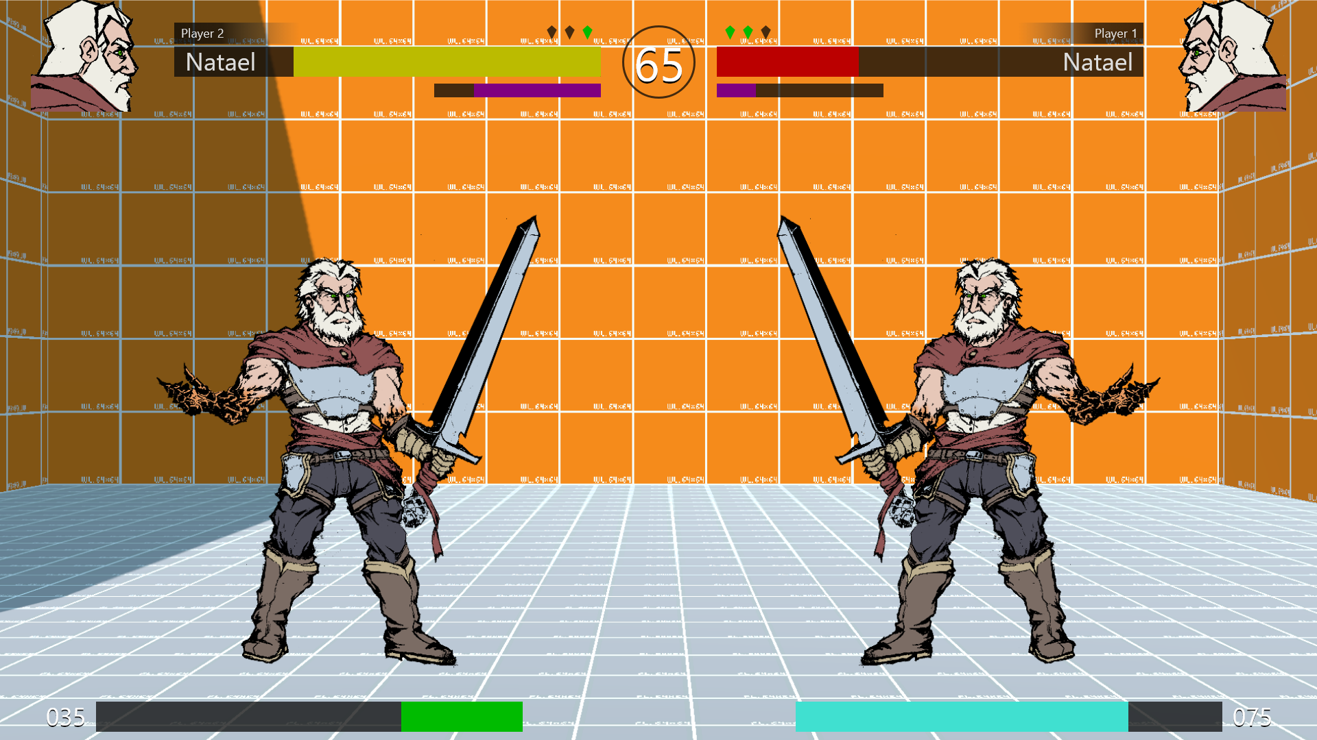
Layout A: holding a multitude of elements below the health bars.
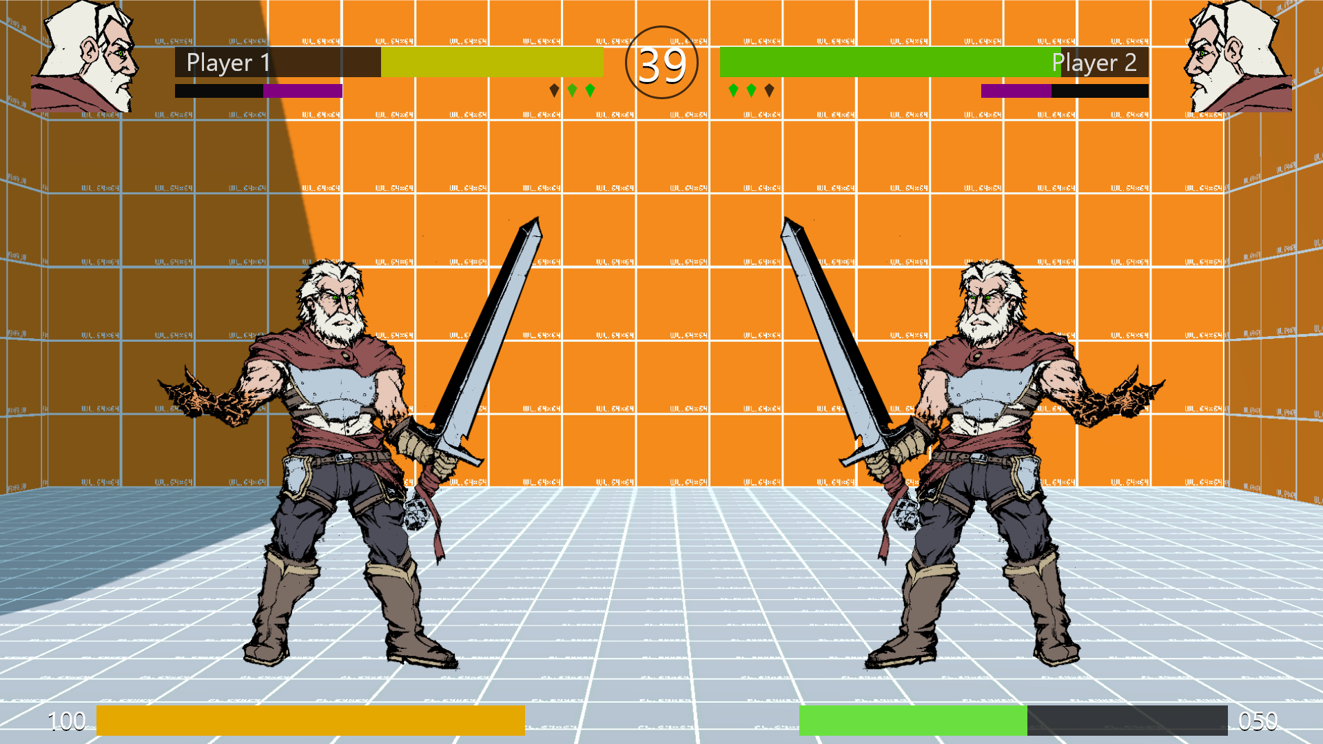
Layout B: Putting elements in a row and flanking the health bar above and below. Additionally, these elements were aligned much closer to the timer.
To choose a layout style I sought to conduct a usability test to determine which has the faster information acquisition rate. I incorporated an A/B test with a questionnaire at the end. This a modified method as an A/B test is supposed to be conducted with a large sample size with each version only being exposed to half of the sample. Due to COVID-19 I only had access to an insufficient sample for the test. Regardless I found it the best method suitable for my goal so I modified it to have the qualitative element of the questionnaire at the end.
I tested for memory retention in a short interval, exposing participants to a design for 3 seconds. They were tasked with memorizing and reciting data represented through the UI. They were then asked to do the same with the other design.
Layout A had the strongest response, with the most data recalled. During the questionnaire, participants shared a greater enthusiasm for Layout A mentioning reading flow (left to right) as a major factor.
Developing the design
Despite this being my first time interacting with the Godot Engine, development went very smoothly. The engine is very intuitive and the scripting language is both simple and powerful.
I started by focusing on implementing the layout proposed by layout B by adding simple shapes. I then added basic functionality to the UI elements, for example: making the health bars move based on a scripted temporary value. Once I confirmed that the elements work as intended, I replaced the temporary values with the appropriate existing value in the game. Any element that didn’t have a value to be connected would keep using the temporary value.
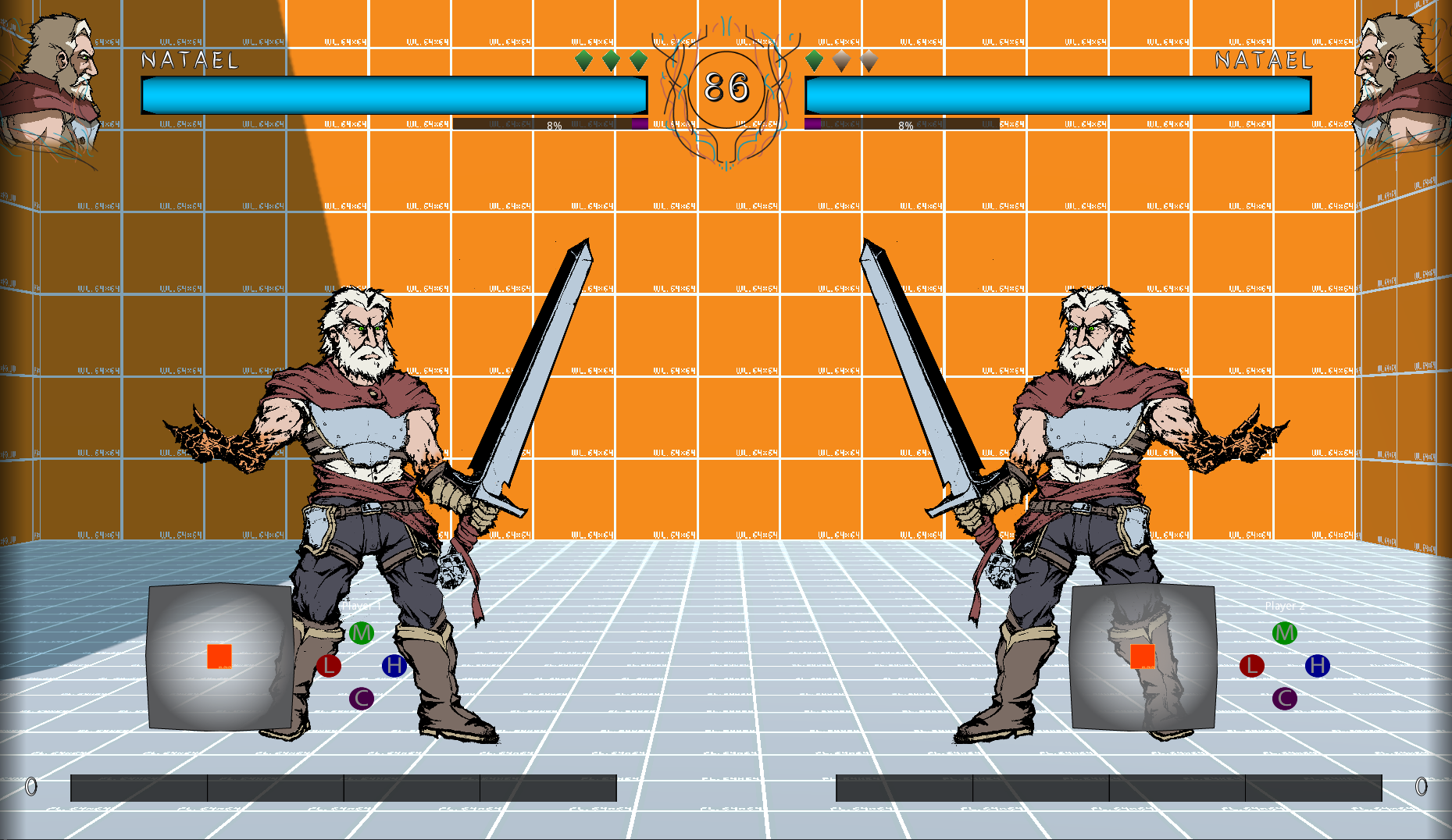
Additional basic styling on UI elements - proof of possible graphic style alterations for the future.
Project Takeaways
My gains from working on the project.
This was my first instance of using my study in combination with my passion. I’m very satisfied with the layout I produced. The aesthetics and visuals for the design can see more stylistic improvements, which I plan to tackle as the project progresses and a visual style for the game is determined.
Using a new engine, I tought, would have been the largest hurdle and took time from the project to learn how to use it. I was surprised how easy it was to begin implementing and prototyping the user interface.
I enjoyed how I was now able to define elements of UI in the games I play and create strong arguments as to why I do or do not like the decisions made by citing user experience factors.
Furthermore, to act on these opinions and produce my own design that sees positive responses during testing was a good confidence booster to my growing skills in UX.
Extra
More - slightly related - information.
The game that I designed the UI for is the current passion project that I’m engaged in. My responsibilities there are mainly as game and creative designer, but I also work in user experience and production. Other members of the project are the collaborators involved in creating the UI. The project is being steadily developed and you can follow the progress on the project’s YouTube channel.